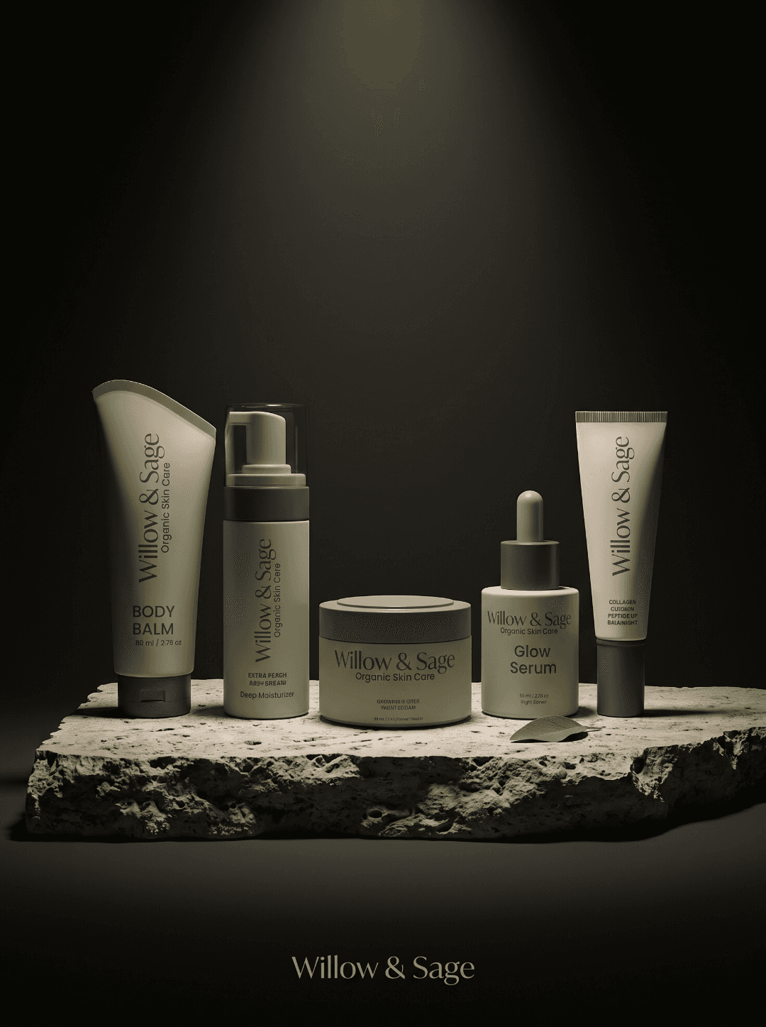
The concept explores a small-batch, plant-based skincare brand for an audience that values both product care and thoughtful design. The scope connects positioning to visual identity, packaging, and supporting brand applications.
Scope
Brand Strategy
Package Design
Visual Identity
Independent concept
Skincare

The Challenge
Create an identity that communicates botanical care and artisanal quality while remaining contemporary. The system needed to balance warmth with restraint and carry a consistent character across the product range.

The Approach
Three principles shape the identity: Organic Roots, Mindful Rituals, and Modern Calm. Refined serif typography, an earthy palette, and botanical compositions connect the brand to its ingredients. Spacing, hierarchy, and restrained layouts give the packaging a quieter, more considered presence.


The Outcome
A coordinated identity and packaging system with a clear typographic hierarchy, color palette, and approach to imagery. The applications demonstrate how the brand can remain consistent across packaging and supporting materials.

